A deeper dive into their analytics revealed another key insight: over 80% of their users were browsing the website from their mobile phones. This meant that a desktop-first approach wouldn’t cut it.
The brand needed a mobile-first experience that not only looked great but also made purchasing effortless. Here’s how we uncovered the real roadblocks.

With this, we crafted a strategy to refine the user flow, improve accessibility, and create a design that truly reflected the brand’s personality. A major focus was on the landing page—it had to be more than just eye-catching; it needed to instantly engage users, highlight key products, and guide them seamlessly into the shopping journey. Every element was designed to make browsing effortless and the overall experience frictionless.
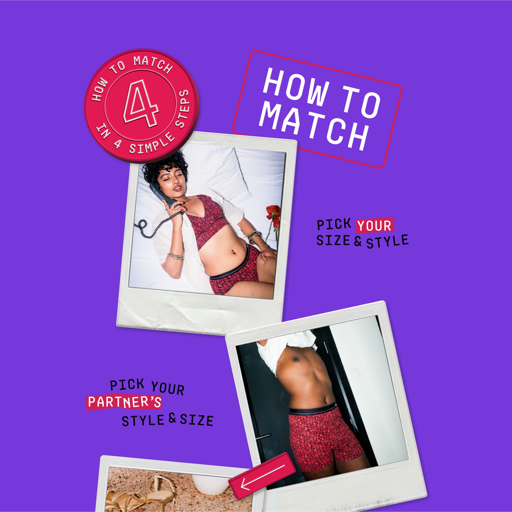
Beyond functionality, we also revisited &Circus’s branding to make sure it was consistent across digital platforms. While their social media presence was strong, their website lacked the same energy. We infused their signature boldness into the design—playful colors, confident typography, and vibrant visuals that resonated with their inclusive and body-positive messaging.


After redesigning &circus' website and optimizing the UX, their conversions saw a significant boost, with users now engaging more effectively with the brand. The new design not only elevated their brand value but also made their offerings clearer and more compelling.
As a result, abandonment rates dropped, leading to a seamless customer journey that directly contributed to business growth. With a site that now works for them—not against them—&circus is thriving like never before.